Case Study
Sand + Steel Art Fest Branding
for the City of Valparaiso
Valparaiso Events and the Valparaiso Creative Council hired me to create the brand identity for their upcoming Sand + Steel Art Fest, in partnership with Indiana Dunes Tourism.
They chose to work with me because of my experience designing for tourism brands that blend story, community identity, and visual impact.
Services Provided:
- Branding
The challenge
Valparaiso had no active art festival brand. A past festival did not continue, and organizers wanted to avoid a generic craft-fair feel.
The aim: create an elevated, art-focused festival identity that blends Indiana Dunes nature, the steel industry, and local creativity while:
Aligning with the Sand + Steel regional initiative and gaining Indiana Dunes Tourism approval
Nodding to Valparaiso Event’s and Valparaiso Creative Council’s brands while feeling fresh and refined
This created a layered challenge: satisfy multiple stakeholders and identities without weakening the creative vision.
The opportunity
This project went beyond creating a logo for marketing materials. It presented an opportunity to:
Establish a visual identity for a new cultural event
Position the festival as a destination experience,
not just a local art and craft show.Create a flexible brand system that could grow year after year into a recognizable regional asset
What began as a request for a logo evolved into a broader brand vision—one that could support tourism, placemaking, and long-term cultural impact for the city.
Where art meets
nature + industry

The approach
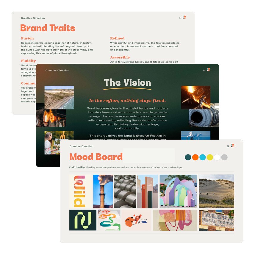
Step 1: Research +
Creative Direction
Researched Sand + Steel, the Indiana Dunes, local industry, and art techniques. Then, I created 3 mood boards for the client to choose a direction from.
Step 2. Design Exploration + Revisions
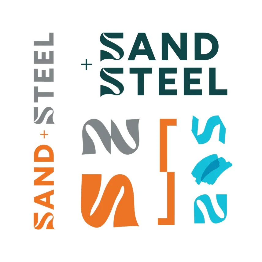
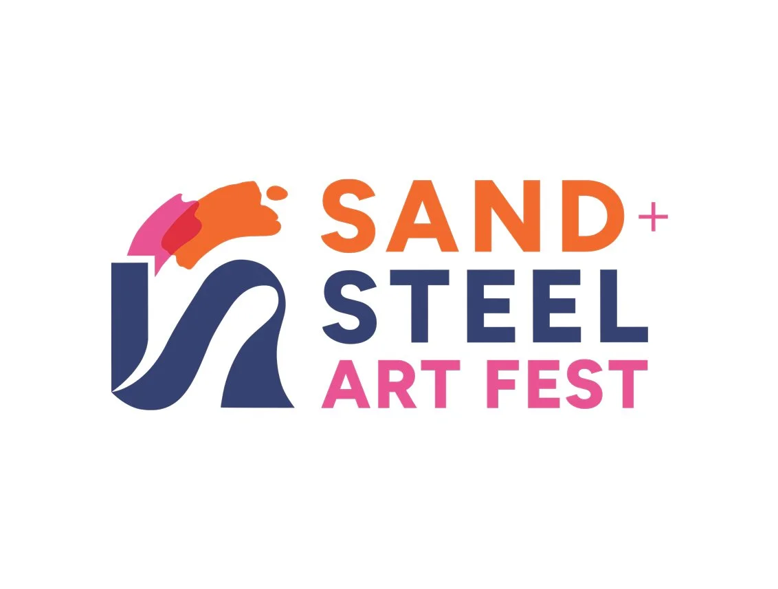
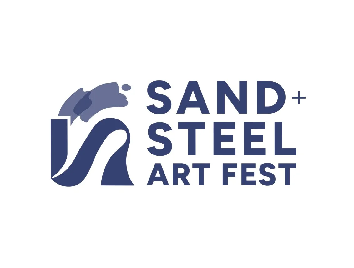
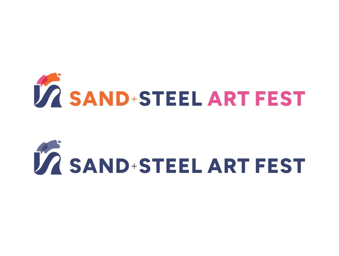
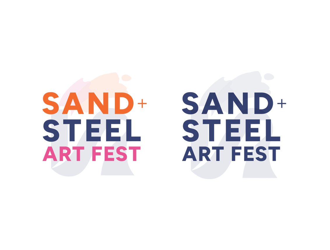
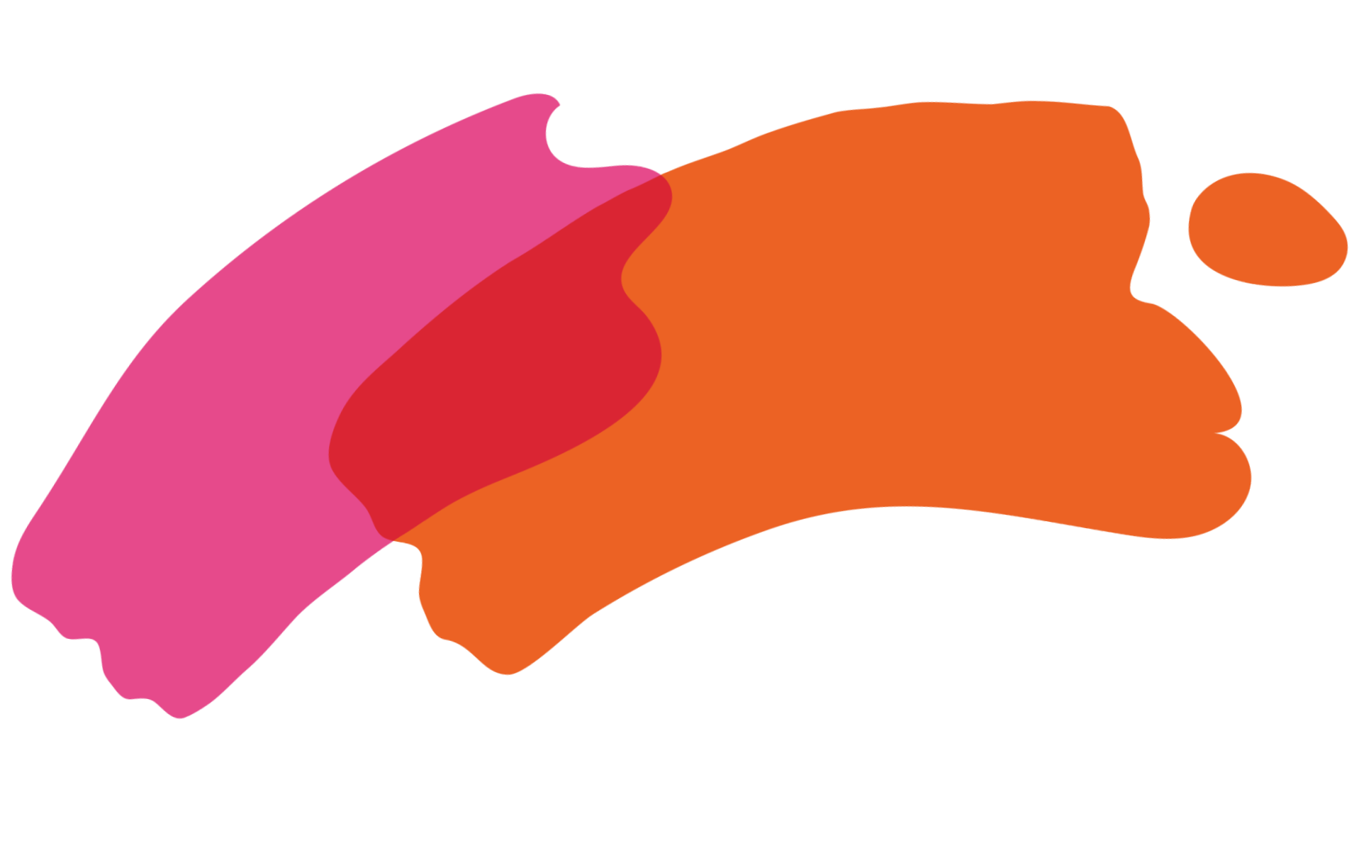
Tested logo variations, color palettes, and font pairings. Turned the S into a steel mill and a dune symbol (when rotated) and also experimented integrating the S into
the wordmark.
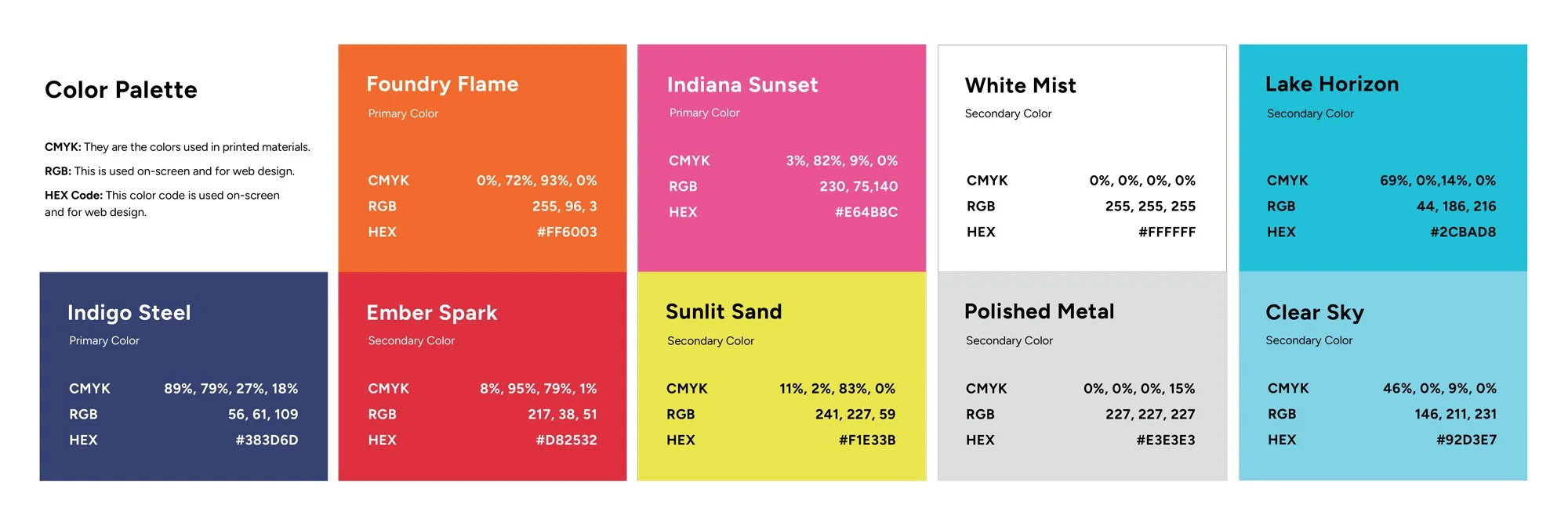
Step 3: Color Palette Refinement
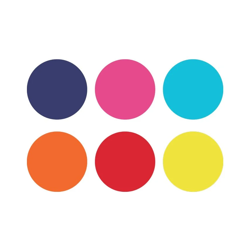
After early exploration, we shifted away from over-integrating existing brand colors and instead built a bold, expressive palette inspired by steel, fire, sand, sky, and summer energy.
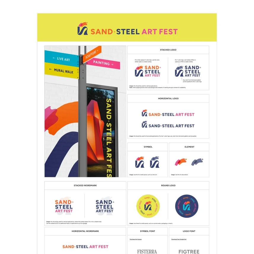
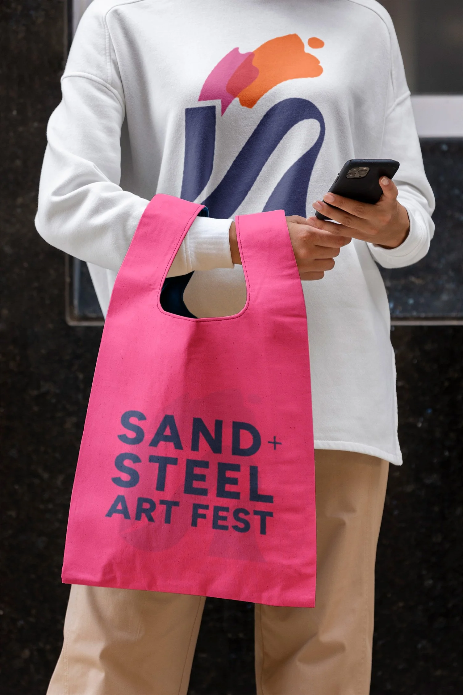
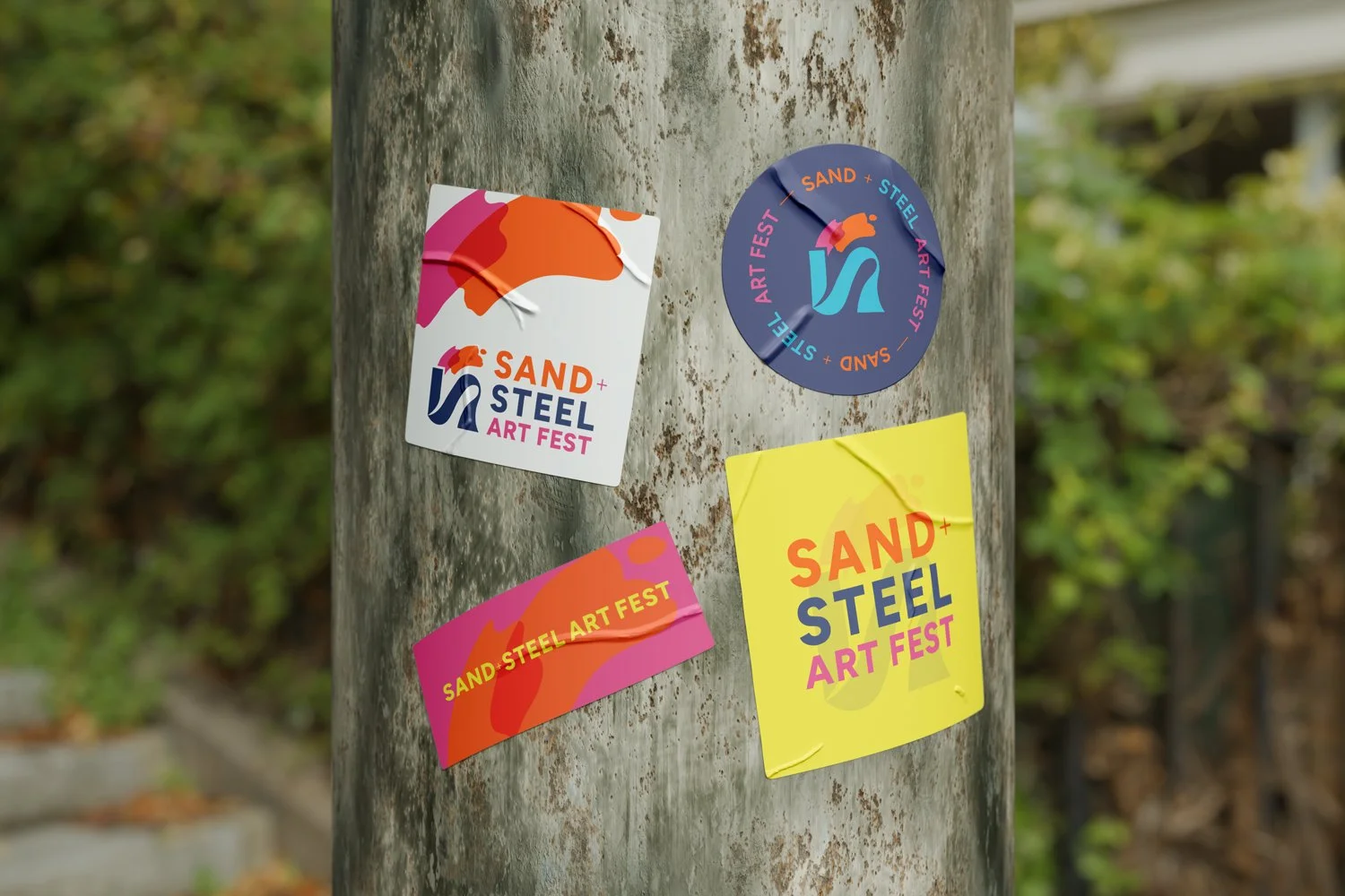
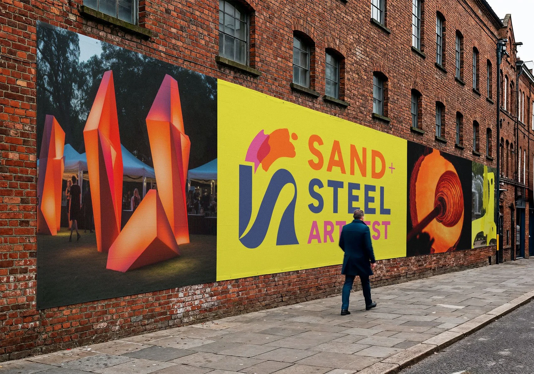
Step 4: Brand Identity
+ Guidelines
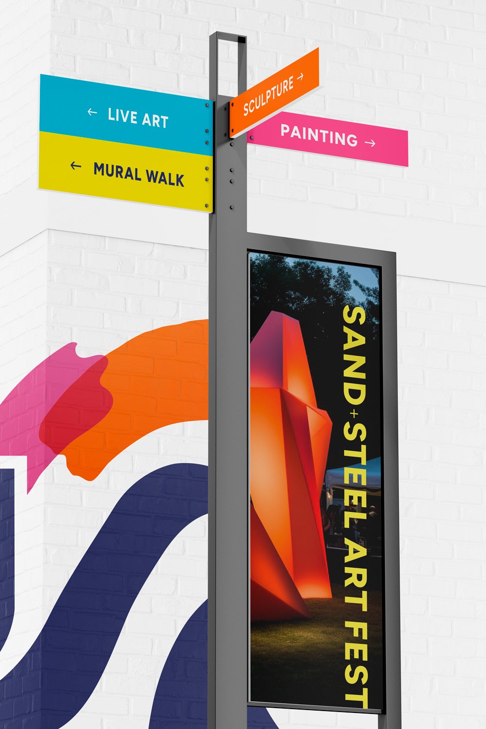
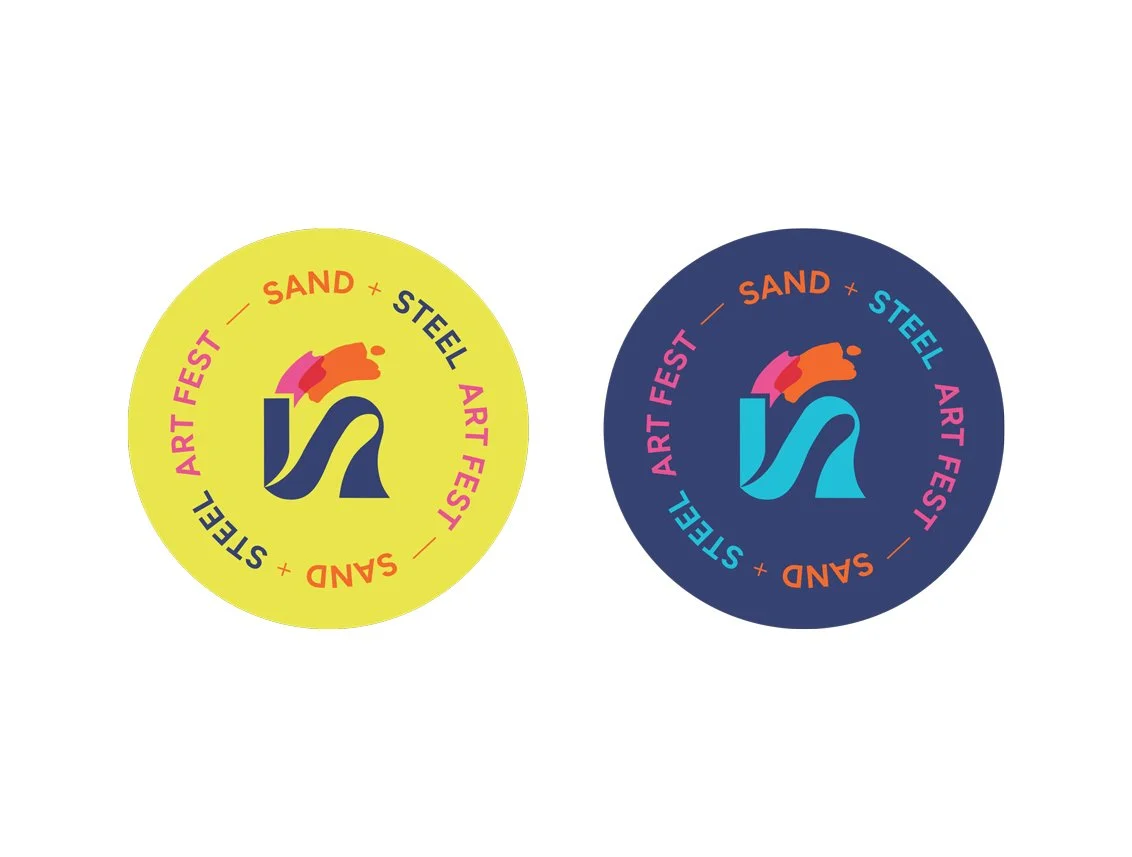
I designed a flexible logo system and simple guidelines with multiple configurations so the brand could live confidently across signage, digital, merch, and future applications.
A placemaking experience for art.
More than an Art Fest
As the branding came together, the conversation naturally expanded from:
“We need a logo for an art festival” to “We are building a bigger experience that represents our region.”
This brand positions Sand + Steel Art Fest as:
a destination event, not just a local festival
a reflection of the region’s identity and story
an experience that feels curated, intentional,
and memorable
A juried chance for notable local and visiting artists to apply with polished work and sell to true art lovers, while still welcoming casual visitors who come for a fun event.

Client love
“Ooooh, I think that’s it, woman!”
-Jessica Corral, Valparaiso Creative Council
“I love these changes! Thank you for
working so quickly to turn this around!”
-Katie Abel, Valparaiso Events
Branding for Your City,
Event, or Organization
Through thoughtful branding, illustration, and storytelling design, we can create experiences for festivals, cultural events, downtown initiatives, tourism campaigns, and placemaking projects to attract visitors, build pride, and leave a lasting impression.
Case Studies
See how Region Design Co. brings personality, purpose, and real-life results to every project.
